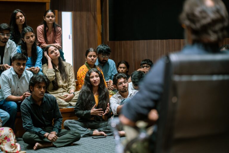
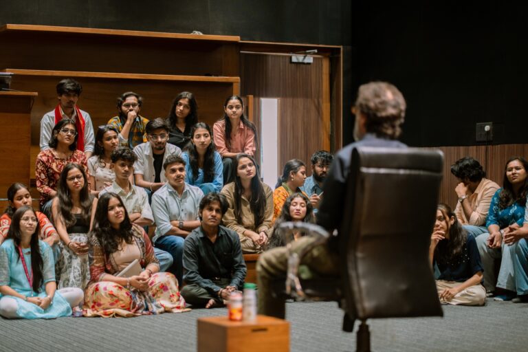
The exhibition opened with the physical origin of blue.
Lapis lazuli, the semi-precious stone mined for six thousand years in the mountains of Afghanistan, produced the pigment called ultramarine. The name means beyond the sea, because European painters in the Renaissance received the pigment through Mediterranean trade routes. Ultramarine was the most expensive pigment in Europe for centuries. It was reserved for the robes of the Virgin Mary in religious paintings. Its cost was a mark of sacred commitment.
The Blue Project traced this trade in material detail.
- The mines of Badakhshan, continuously operating since 7000 BCE.
- The grinding and processing techniques that separated the true ultramarine from its lower-grade alternatives.
- The introduction of synthetic ultramarine in 1828, which collapsed the price and democratised the colour.
- The simultaneous development of Prussian blue in 1704, the first modern synthetic pigment.
Visitors walked out of the opening room understanding that blue was not a given. It was a commodity that had to be extracted, traded, processed, and earned.
Read More: Nitesh Mohanty at PID
Hokusai, Cyanotype, and Anna Atkins
The second room turned to Asia and to the scientific use of blue.
This session was related to the science of blue.
Katsushika Hokusai‘s woodblock prints, particularly The Great Wave off Kanagawa from around 1831, used Prussian blue. The waves are blue, the sky is blue, which is different from the foam that is white.
Hokusai’s prints circulated from Japan to Europe and directly influenced Impressionists like Monet and Van Gogh, carrying a new visual language of blue with them.
Anna Atkins, working in Victorian England, took blue into the scientific domain.
“In 1843, she produced the first book ever to be illustrated entirely with photographic images. Photographs of British Algae: Cyanotype Impressions.”
The cyanotype process, invented by Sir John Herschel in 1842, uses iron-salt chemistry to produce a deep Prussian blue image. Atkins used it to catalogue plant specimens with precision. Her book predates the commercial photography industry and represents one of the earliest intersections of science, design, and documentation. Her work is still referenced by contemporary Indian photographers including Hari Katragadda, whose Ganga cyanotypes appeared in the Blue Project’s contemporary-photography section.
Read More: What Is The Curriculum of B. Design at PID?
Krishna, Kali, and the Sacred Blue of Indian Iconography
The Blue Project’s third room moved to the Indian subcontinent and the sacred iconography of blue divinity.
Krishna is blue. Kali is blue. The choice is not arbitrary. Hindu iconography encodes colour with meaning that predates the pigment trade. The blue of Krishan represents the skies, oceans and the divine that contains all the forms. Kali’s dark blue depicts the time and the eternity where all actions take place and dissolve.
The exhibition placed Krishna and Kali imagery alongside contemporary reinterpretations.
- Traditional Pichwai paintings from Nathdwara, with Krishna as the central figure.
- Kalighat paintings of Kali from nineteenth-century Bengal, rendered in distinctive folk-art strokes.
- Contemporary graphic-design reinterpretations by Indian artists working with these iconographies in new media.
The juxtaposition forced visitors to see that Indian blue is not a copy of European blue. It has its own history, its own meaning, and its own continuous contemporary practice. A design student studying colour theory through only the Goethe tradition would miss half of the story.
Read more: VFDF 4.0 at Parul Institute of Design: complete festival guide
Kieslowski, Joni Mitchell, Blue Note: Cinema and Music
The fourth section moved into twentieth- and twenty-first-century cinema and music.
Krzysztof Kieslowski’s film Trois Couleurs: Bleu (Three Colors: Blue, 1993) uses the blue color as a structural device. In this movie the main character, Julie, has lost her husband and daughter in a car accident. The film shows her journey of experiencing grief and healing, with blue appearing in windows, swimming pools, crystal chandeliers, and musical fragments.
The color is not decoration. It is the visual register of her emotional state.
Read more: Krzysztof Kieslowski: director’s full bibliography and filmography
Joni Mitchell’s 1971 album Blue represents the musical parallel. Released at a moment when the singer-songwriter movement was at its peak, the album uses the colour as emotional shorthand for depression, intimacy, and longing. Every song on the album reads as a letter that should not have been sent but was.
Read more: Joni Mitchell: official archive of the Blue album
Blue Note Records, the jazz label founded in 1939, represents the third musical pillar of the exhibition.
“The label’s album covers, designed by Reid Miles and photographed by Francis Wolff, established a visual language for jazz that is still being referenced seventy years later.”
The Blue Note room at the exhibition reproduced several of the iconic album covers and traced the graphic design decisions that made them iconic: the typography choices, the photographic crop, the single-colour saturation.
Carl Sagan, Rebecca Solnit, and the Cosmic Scale
The fifth section pulled back to a cosmic scale.
Carl Sagan’s Pale Blue Dot speech, delivered after the Voyager 1 spacecraft photographed Earth from six billion kilometres away in 1990, described the planet as a mote of dust suspended in a sunbeam. The entire human story, all wars and loves and civilisations, contained in a single pale blue pixel.
The Blue Project featured an audio recitation of the passage in the exhibition space. Visitors who paused to listen heard the cosmic context that makes blue, the only planet we know to be blue from space, both fragile and precious.
Rebecca Solnit’s writing on blue added another layer.
“The world is blue at its edges and in its depths. Blue is the colour of longing for the distances you never arrive in.”
Solnit‘s passage, from her book A Field Guide to Getting Lost, appeared in the exhibition alongside Sagan’s recording. The pairing connected the scientific scale of the universe with the emotional texture of human experience. Both writers use blue to describe what cannot be fully reached. The horizon. The depths. The past.
Ambedkar, Frida Kahlo, and Blue as Identity
The sixth and most politically weighted section connected blue to identity and liberation.
Dr. B. R. Ambedkar’s book Annihilation of Caste, originally prepared in 1936 as an undelivered speech, is published with a blue cover. Blue has become the colour of Dalit identity and political consciousness in India. The Republican Party of India uses blue. Dalit flags use blue. The association is not accidental. Ambedkar chose the colour as a deliberate alternative to the saffron and green that already dominated Indian political symbolism.
Read more: Dr. B. R. Ambedkar: full biographical reference
Frida Kahlo‘s La Casa Azul, the Blue House in Coyoacán, Mexico City, where she lived with Diego Rivera, serves as the exhibition’s closing image.
“The house is painted an intense cobalt blue. The colour is almost aggressive in its saturation. It does not ask to be liked. It announces presence.”
The colour choice for the Kahlo house, still preserved today as a museum, represents identity assertion through colour. A woman, a Mexican, a disabled artist, a communist, claimed a colour and made it inseparable from her name. The exhibition used the Kahlo image to close the loop on the political dimension that opened with Ambedkar.
The Word Cloud: Six Hundred Responses
Before the exhibition opened, Nitesh Mohanty ran an Instagram prompt asking followers for a single word they associated with blue.
Six hundred responses came back. They ranged from the expected (sky, ocean, calm) to the surprising (grandmother, cotton sari, first bicycle, hospital ceiling, father’s cologne).
The responses were compiled into a word cloud that filled one wall of the exhibition.
- The most frequent responses created the visual spine of the cloud.
- The rare, highly personal responses created the smaller text around the edges.
- Visitors could walk the wall looking for their own answer or discovering someone else’s memory.
- The cloud operated as both data visualisation and emotional document.
The effect was to make the abstract idea of the exhibition concrete. Six hundred strangers had contributed their private associations with blue. The exhibition was a conversation, not a lecture.
This is what curatorial thinking at the highest level looks like. A single theme, pursued across six centuries and six continents, with audience participation built into the research itself. The project demonstrates what the B.Design and B.Sc programmes at the Parul Institute of Design can produce when students and faculty engage with design as a research discipline rather than as a purely aesthetic practice.
Read more: B.Design Communication Design at Parul Institute of Design