Logo vs Branding: They Are Not the Same Thing
Prince Bhadania drew a sharp line between two things most people use interchangeably. A logo is simply a visual symbol – a mark, shape, or image representing your company. Branding is the much larger and deeper story surrounding that symbol: your colours, fonts, tone of voice, packaging, communication style, and every feeling a person gets when they encounter your company. Branding is not what you say about yourself – it is what your customer feels about you before they read a single word or use your product.
The Five Principles of Great Logo Design
- Simple – anyone should understand and recognise it at a single glance without explanation.
- Memorable – after seeing it once, it should stick in your mind and return the next time you think about that brand.
- Scalable – must look equally clean whether printed tiny on a business card or blown up massive on a billboard. Coca-Cola, Chanel, and Nike work beautifully at every size.
- Timeless – should not look fashionable today and outdated tomorrow. Coca-Cola‘s logo has barely changed in over a hundred years and still feels fresh.
- Typography matters deeply – the font sends a silent emotional message. Google uses a soft, rounded, friendly font (approachable, trustworthy). Netflix uses a heavy, bold font (powerful, premium, serious). Your font choice shapes perception before anyone reads the words.
Hidden Storytelling: What the Amazon Logo Really Means
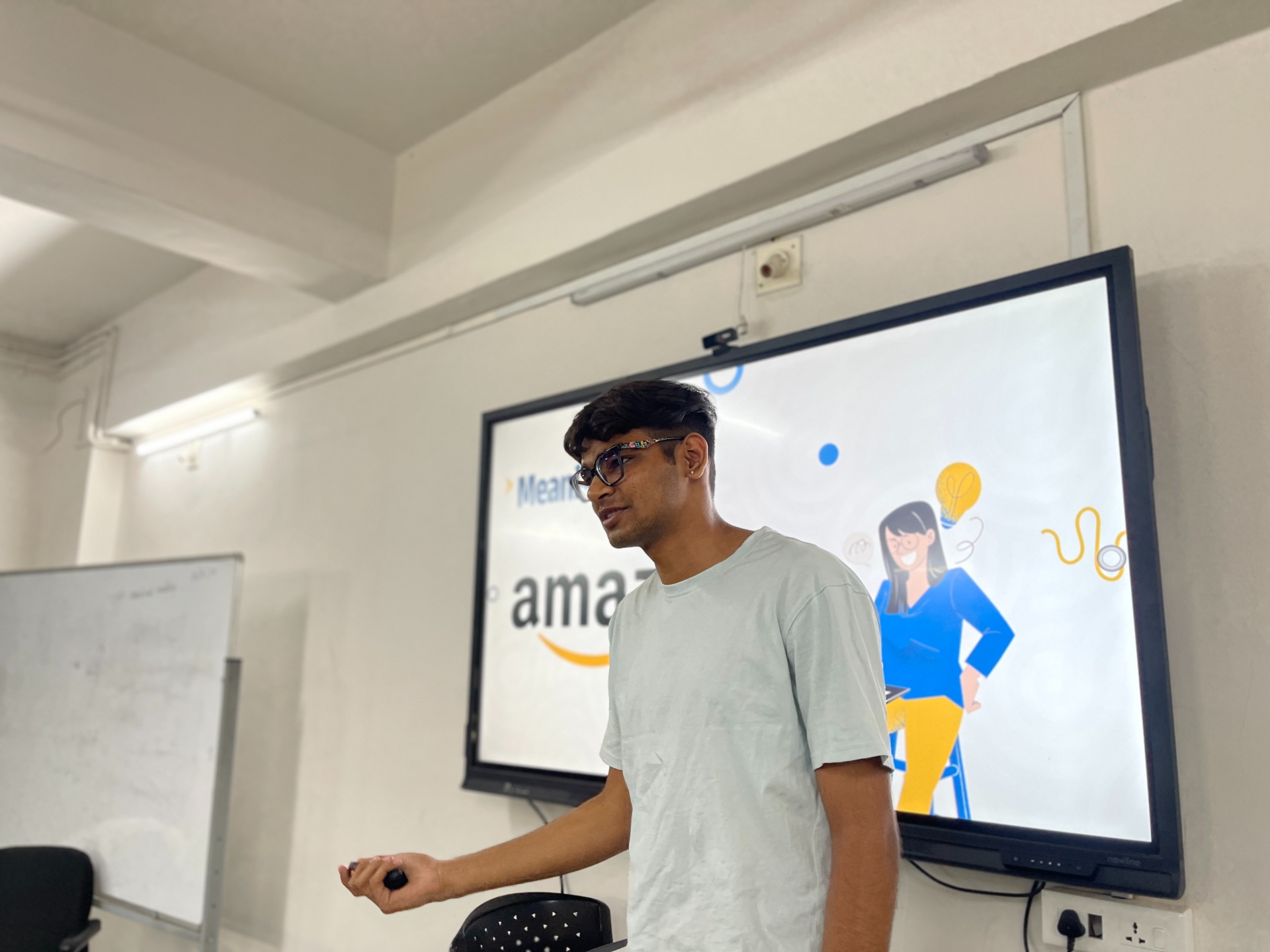
Prince Bhadania used the Amazon logo as one of the smartest examples of hidden storytelling. The curved arrow beneath ‘Amazon’ goes from the letter A to the letter Z – a quiet, clever message telling the world they sell everything from A to Z. The arrow also forms a smile. That is the beauty of a truly great logo: it carries meaning without needing words to explain it, and once you see that meaning, you never unsee it.
Colour Psychology: Why Zomato Uses Red
The colours a startup chooses are not just design preferences – they are emotional triggers that tell customers how to feel before any interaction. Zomato uses red because red is psychologically linked to hunger, urgency, excitement, and appetite – exactly the emotional state a food delivery app wants to create the moment users open it. Prince Bhadania emphasised that colour choice must be intentional and aligned with the emotion you want your brand to evoke. Branding plays a major role in any startup’s growth story. If you wish to contribute to the design industry, begin your journey by exploring Design Programmes by Parul Institute Of Design!
Two Branding Failures That Cost Millions: GAP and Tropicana
Prince Bhadania closed with two case studies that hit harder than any theory. GAP and Tropicana – both massive, globally recognised brands – made the mistake of changing their logos and packaging without understanding how deeply their customers were emotionally attached to the original design. Both brands lost millions of customers almost overnight because people no longer felt the same familiarity, warmth, and trust. The lesson: branding is not about looking modern – it is about building a deep, lasting emotional bond with your audience that must never be changed carelessly. To explore in depth, head here to read IDEO – Design Thinking and Branding Resources!