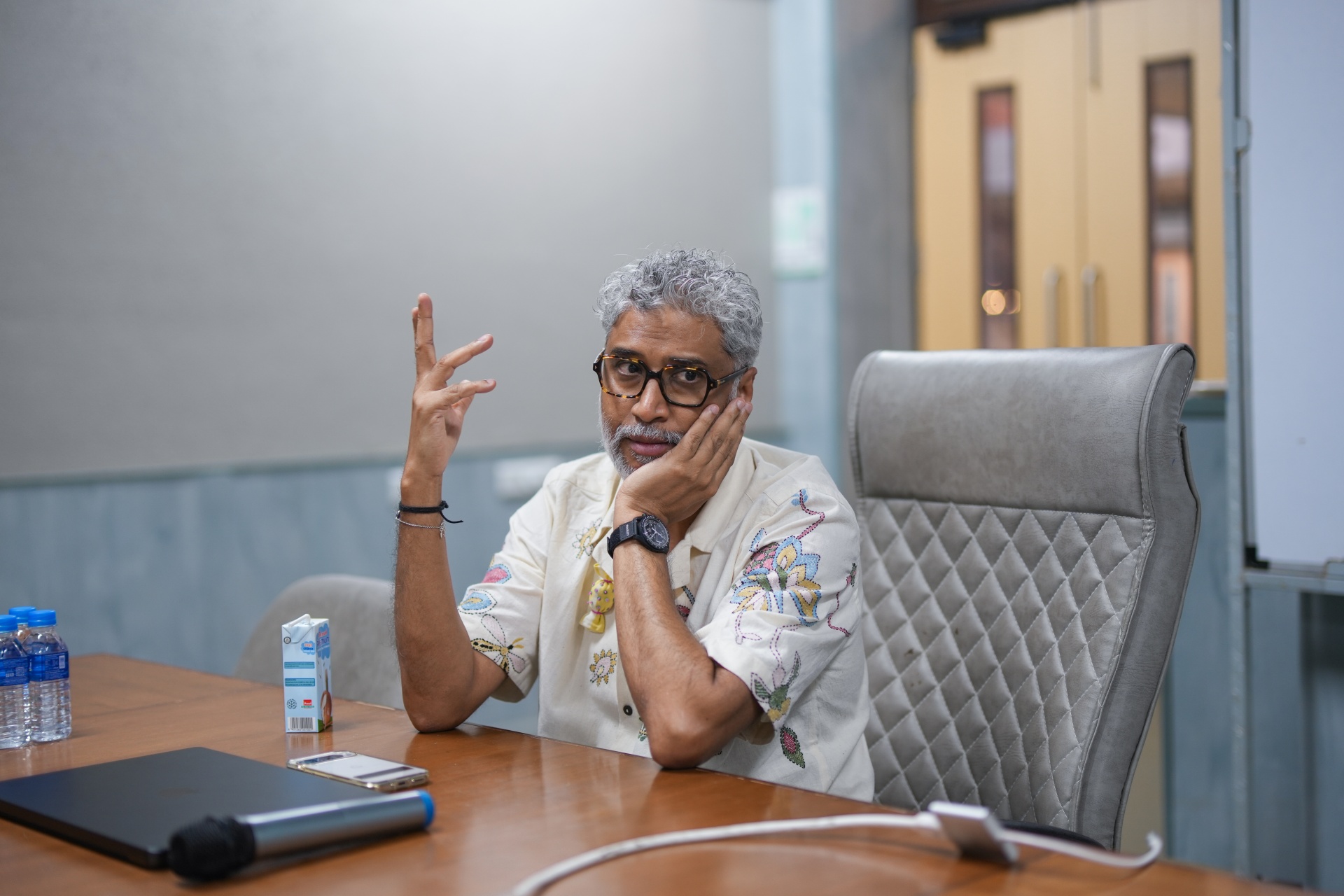
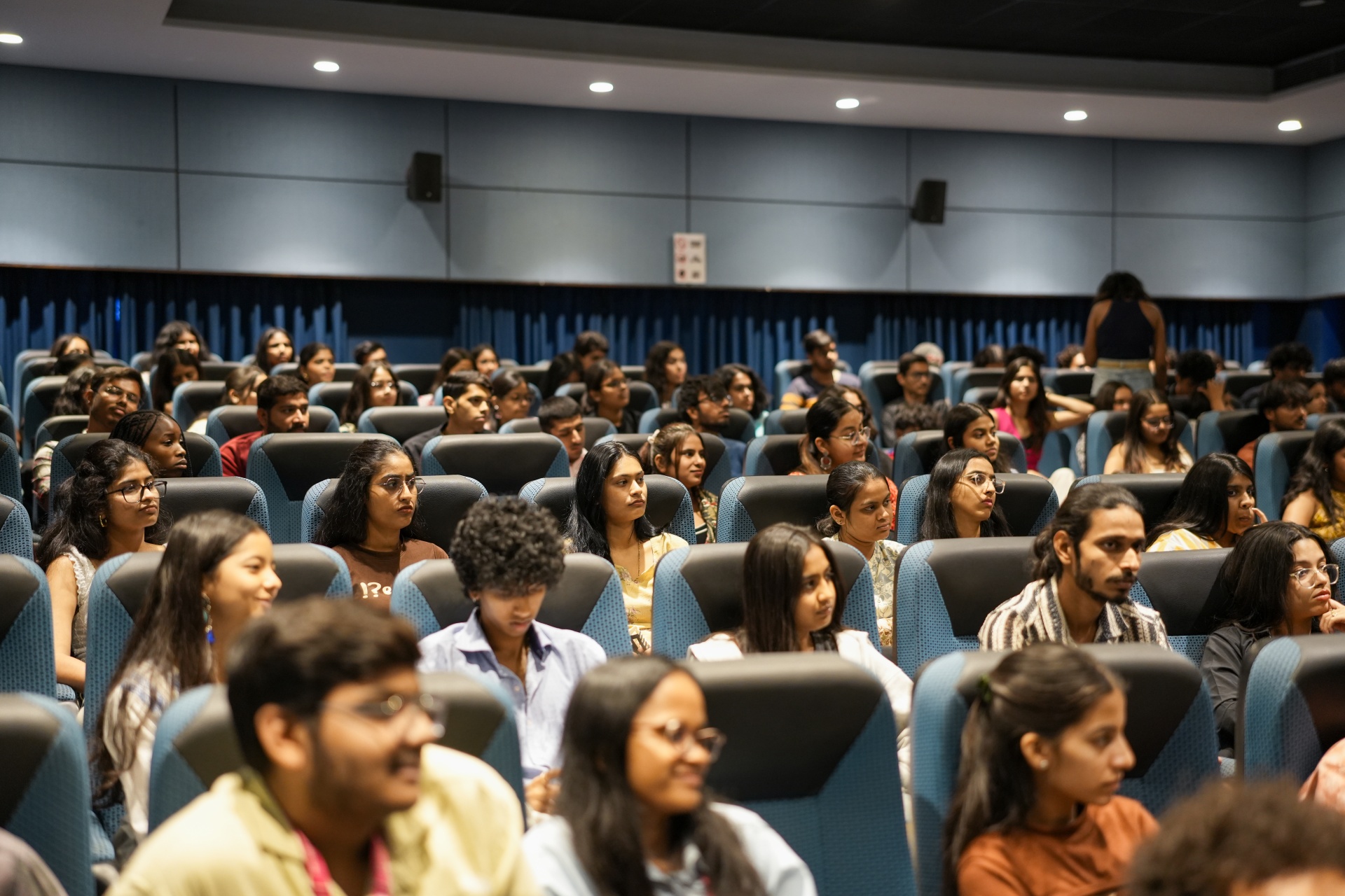
On Day 3 of the Vadodara Film and Design Festival at Parul Institute of Design, an educator told a room of design students that curating begins with refusing to accept the first interesting answer.
Nitesh Mohanty, aka Nimo, is an curator, design thinker, educator and founder of Root Network design studio and school based in Goa. His exclusive session named Ways of Seeing, was built around a single exhibition he curated with an international artist (co-curation). This exhibition took one questions and refused to stop asking it until it had travelled across centuries & disciplines – can one colour provide access to all the forms of art-based expression & human existence?
The blue colour was the answer and the exhibition ran long enough to say the answer was yes!
Why Blue: The Colour That Travels Across Language
Blue appears in almost every language as a distinct word. Neel in Hindi. Azul in Spanish. Blau in German. That distribution is unusual. Most colour vocabularies vary wildly across cultures. Blue is one of the few that crosses linguistic borders intact.
The exhibition team used that universality as a starting point. They traced blue across are –
- Afghan’s Lapis Lazuli – The semi precious gemstone that were provided Renaissnace painters with ultra-marine pigment for Virgin Mary Robes.
- Japanese Woodblock Prints – Stylish and handfully crafted, Hokusai’s Great wave where the deep indigo blue became a premium signature of the form!
- Hindu Iconography – Lord Krishna as depicted in blue, Goddess Kali is depicted in blue after absorbing’s Lord Shiva’s poison.
- Cyanotype Photography – Blue-printed photographic technique was highly revered.
- Bandhani Textile Craft – As rooted in Gujarat’s material culture.
The range of the research was the point. A curator’s job, Mohanty argued, is not to pick one definition and stop. It is to follow a single thread until it reveals connections the viewer had not previously imagined. If you’re equally passionate about how colour theory works and differ, enrol into Parul University’s Bachelor of Design (B.Des) in Communication Design to learn how you can create unique digital brand experiences across different brands!
Carl Sagan and the Pale Blue Dot: The Passage That Anchored the Exhibition
Nitesh Mohanty read aloud to the PID room from Carl Sagan‘s famous meditation on the 1990 NASA photograph of Earth taken from billions of kilometres away by Voyager 1. The photograph is known as the Pale Blue Dot.
The name itself, Nitesh pointed out, carries meaning. The photograph is not called the Pale Yellow Dot or the Pale Brown Dot. It is blue, because water covers most of Earth’s surface. Landmass barely registers from that distance. Human civilisation occupies almost none of the visible pixel.
“No one ever explained Earth to me as beautifully, as poetically. Because we are small. And we are so, so insignificant.”
The curatorial logic: the Pale Blue Dot is not just a scientific fact. It is a philosophical argument about scale. The exhibition used that argument to remind viewers that the colour blue carries the weight of cosmic perspective, not just aesthetic preference.
Vadodara Film & Design Festival 4.0 – Master Designing in the Age of AI!
Water Isn’t Blue - Rebecca Solnit on Depth & Distance
This exclusive exhibition included a passage from Rebecca Solnit’s book – A Field to Getting Lost, the argument was – water is not inherently blue, it’s clear and the blueness viewers see is the result of light scattered via depth.
“The distance between the bed of that sea and the surface is what determines the shade.”
The curatorial point: beauty we perceive as intrinsic is often the product of distance, depth, and circumstance. When a viewer at the Maldives sees brilliant turquoise water, that turquoise is not in the water. It is in the physics of light travelling through a specific depth. Blue is a metaphor for everything humans perceive as essential but is actually created by relationship.
Solnit personally gave the exhibition permission to use the text. That permission mattered to Mohanty. Curation that claims cultural material without credit is extraction. Curation that asks is community. In this era of AI, if you’re in awe with how colour theory differs from brand to brand, interest to industry, enrol into PU’s Bachelor of Design in User Experience & Interaction Design (with AI) and get your career rolling at the intersection of techno-creative brands!
The Blue Library: A Physical Archive of Every Blue Book the Team Could Find
A physical section of the exhibition was dedicated to books where blue appeared as theme, motif, or metaphor. Titles on display included:
- The Proudest Blue
- Anna Atkins: Blue Prints
- The Blue Book by Amitava Kumar
- Cobalt Blue by Sachin Kundalkar, translated from Marathi by Jerry Pinto
- Indigo and Blue Is the Warmest Colour
His parenthetical on the Cobalt Blue film adaptation was blunt. A very bad film. A very good book. He asked students to read the original Kundalkar novel rather than watch the film.
The library was not a display to look at. It was an invitation to handle, read, and sit with the material. Visitors could pick up any book and read it. That physical engagement was part of the curatorial thesis: blue is not an image to project. It is a depth to enter.
Anna Atkins: The 19th Century Woman Who Invented the Blueprint Before Photography Knew What It Was
A foundational reference in the exhibition was Anna Atkins, widely regarded as the world’s first woman photographer and a pioneer of the cyanotype technique. Her botanical contact prints (white plant specimens ghosted against a vivid Prussian blue ground) predate much of what would later be called photography.
The cyanotype process has survived into contemporary practice. Weekly cyanotype workshops now run at several Indian design institutes. The blueprint (the literal architectural blueprint used to build buildings) is a direct descendant of Atkins’s process.
Nitesh Mohanty’s point: a 19th century botanist, using light and chemicals to record plants, inadvertently invented the document format that made modern industrial architecture possible. Curation reveals these lineages that specialists often miss.
Three Colours Blue: The Film That Showed What Grief Looks Like in One Colour
Mohanty’s favourite film, he told the PID room, is Krzysztof Kieslowski’s Three Colours: Blue (1993), the first film of the director’s trilogy on the French national colours of liberty, equality, and fraternity.
Blue is the film about liberty, but its actual subject is a woman trying to break all ties with other people after personal loss. The colour blue recurs throughout as a structural device, signalling her inner state. Kieslowski does not explain blue. He uses it until the viewer feels it.
“I can see this film a hundred million times and not get bored of it. It is a story of grief, of loss. And that’s why, perhaps, Kieslowski used blue.”
The lesson for PID students: visual design at its highest level is not about decoration. It is about giving a single element (a colour, a line, a material) enough weight that it carries meaning across an entire work. This is what separates decorative art from durable art. If you’re passionate about visual design and how it varies at global scale, enrol into PID’s B.Sc in Film & Production program right away!
Music and Colour: Joni Mitchell, Blue Note Records, and a Crowd-Sourced Playlist
The exhibition engaged with blue as a musical dimension. Joni Mitchell‘s 1971 album Blue was featured prominently. It is a deeply personal record about loss, separation, and the feminist experience of love. Blue Note Records, the jazz label whose catalogue includes Miles Davis, John Coltrane, Lee Morgan, Art Blakey, and Thelonious Monk, was installed as a curated listening room within the gallery.
Mohanty also created a Blue Playlist by asking friends to submit one song that made them feel blue. The responses drew from Kumar Gandharva, Prabha Atre, Begum Akhtar, Adele, Jeff Buckley, Nusrat Fateh Ali Khan, Ravi Shankar, Yo-Yo Ma, Nirvana, and Fleetwood Mac. The playlist ran in the gallery as ambient sound.
The 600 Instagram Responses That Became Part of the Exhibition
To make the exhibition participatory, Nitesh Mohanty posted a simple question on Instagram: what is the first word that comes to mind when you think of the colour blue? Over 600 people responded.
The range was the exhibition’s human dimension. Expected words: ocean, sky, calm, water, tranquility. Unexpected ones: my father, melancholy, a marble, my yoga mat, and Vincent van Gogh. Every response was a private memory triggered by a single colour.
The team projected all 600 responses on a continuous loop inside the gallery. Visitors reading the loop saw their own memories reflected in the memories of strangers. The exhibition was not just about blue. It was about how many private lives one colour holds.
The Political Blue: Ambedkar, the Inland Letter, and the Sky's Vastness
The exhibition also contained politically charged elements. Dr B.R. Ambedkar‘s book Annihilation of Caste was displayed with its cover in blue, the colour of Dalit identity. As the exhibition text noted: blue is the colour of the sky, which shows vastness, and that was the vision of Babasaheb.
Stacks of the iconic Indian Post Office blue inland letter were made available for visitors to write and post to someone they loved. Before Instagram, before Google, before WhatsApp, this was how people communicated across distances. Making the inland letter available in the gallery was an act of restoration, reconnecting visitors to a slower form of connection.
What Nitesh Mohanty Told PID Students About Curating, Focus, and Typography
Beyond the exhibition walkthrough, Nitesh Mohanty delivered practical advice to the design students present. 3 points landed especially hard –
On finding your sign
Nitesh Mohanty acknowledged he likely has undiagnosed ADHD. He recalled having 28 browser tabs open while researching one project, jumping from The Godfather to Mahatma Gandhi to Robert Flaherty in a single afternoon. His advice: treat each subject like a relationship. Give it your full attention. Learn everything you can. Feel inspired. Then move on. A tab is like a person. One at a time.
On design as subtraction
Design is not addition. It is subtraction. Like sculpture, which begins with a lump of clay and extracts until only the essential form remains. He told PID students the business of design is iteration, not options. A good designer does not present 15 concepts. A good designer presents one concept refined 15 times.
“Is this important? Is this important? And remove, remove, remove, till you have the essence.”
On teaching and falling in love
Mohanty’s job when teaching typography in three days, he said, is not to teach typography. His job is to make students fall in love with typography. Once a student loves the subject, the learning follows automatically. The teacher’s primary responsibility is emotional, not informational.
This approach aligns with the way PID’s Communication Design programme treats visual disciplines. Typography, colour, and composition are not taught as standalone techniques. They are taught as entry points into the designer’s lifelong relationship with the materials of visual expression.
FAQs
Who is Nitesh Mohanty?
Nitesh Mohanty is an interdisciplinary curator, design thinker, educator, and creative practitioner. He is the founder of Root Network, a design studio and school based in Goa. He has co-curated exhibitions including the Blue Project and teaches typography and design thinking at Indian design institutions.
What is the Blue Project exhibition?
The Blue Project is an exhibition co-curated by Nitesh Mohanty that traces the colour blue across cultures, centuries, and disciplines. The exhibition includes Afghan lapis lazuli, Bengali Pattachitra art, Frida Kahlo's La Casa Azul, Krzysztof Kieslowski's Three Colours Blue, Joni Mitchell's album Blue, Blue Note Records jazz, Carl Sagan's Pale Blue Dot passage, Anna Atkins's cyanotypes, and a physical Blue Library of blue-themed books.
What is a cyanotype?
A cyanotype is a photographic printing process that produces a blue print. Invented in the 19th century, it was used by Anna Atkins to create botanical specimens prints showing white plant forms against a vivid Prussian blue background. The blueprint (the architectural document format) is a direct descendant of the cyanotype process.
Does Parul Institute of Design offer a Communication Design programme?
Yes. Parul Institute of Design offers a Bachelor of Design in Communication Design (Visual Communication) covering typography, colour theory, motion graphics, packaging design, magazine and publication design, virtual production, and digital hierarchy. The programme brings in visiting practitioners including Nitesh Mohanty (Root Network, Goa) for typography and curation sessions. PID also offers Fashion Design and Technology, Product Design, Interior and Furniture Design, and User Experience and Interaction Design with AI. Admission to all design programmes is through PU-DAT.
What did Nitesh Mohanty tell design students about design process?
At Parul Institute of Design's VFDF 4.0 on 10 April 2026, Mohanty told students design is subtraction, not addition. The process resembles sculpture: begin with a rough form and extract material until only the essential remains. He also described design as the business of iteration rather than options. A designer should not present 15 concepts. A designer should present one concept refined 15 times.
What is the Pale Blue Dot?
The Pale Blue Dot is a 1990 photograph of Earth taken by NASA's Voyager 1 spacecraft from 6 billion kilometres away. The photograph shows Earth as a tiny dot against the vastness of space. Carl Sagan wrote a famous philosophical meditation on the image, arguing that human civilisation occupies an almost invisible pixel in the visible universe. The photograph features in the Blue Project exhibition as an anchor image for the exhibition's meditation on scale.

